01Welcome
Welcome in. In this one I'm showing you how we built a full website in Claude Design, with the interactions, the animations, the whole thing.
Quick context before we start: I've been a web designer and branding guy for decades. I say that because you can't get this result by opening Claude Design and typing a prompt. There's a process behind it, and we've spent real time building Claude skills that follow that process.
This is part one of a short series, three or four videos, and it covers the two things everything else sits on: the discovery and the design system.
You can't prompt your way to this. You can process your way to it.
02The concept: The Iru
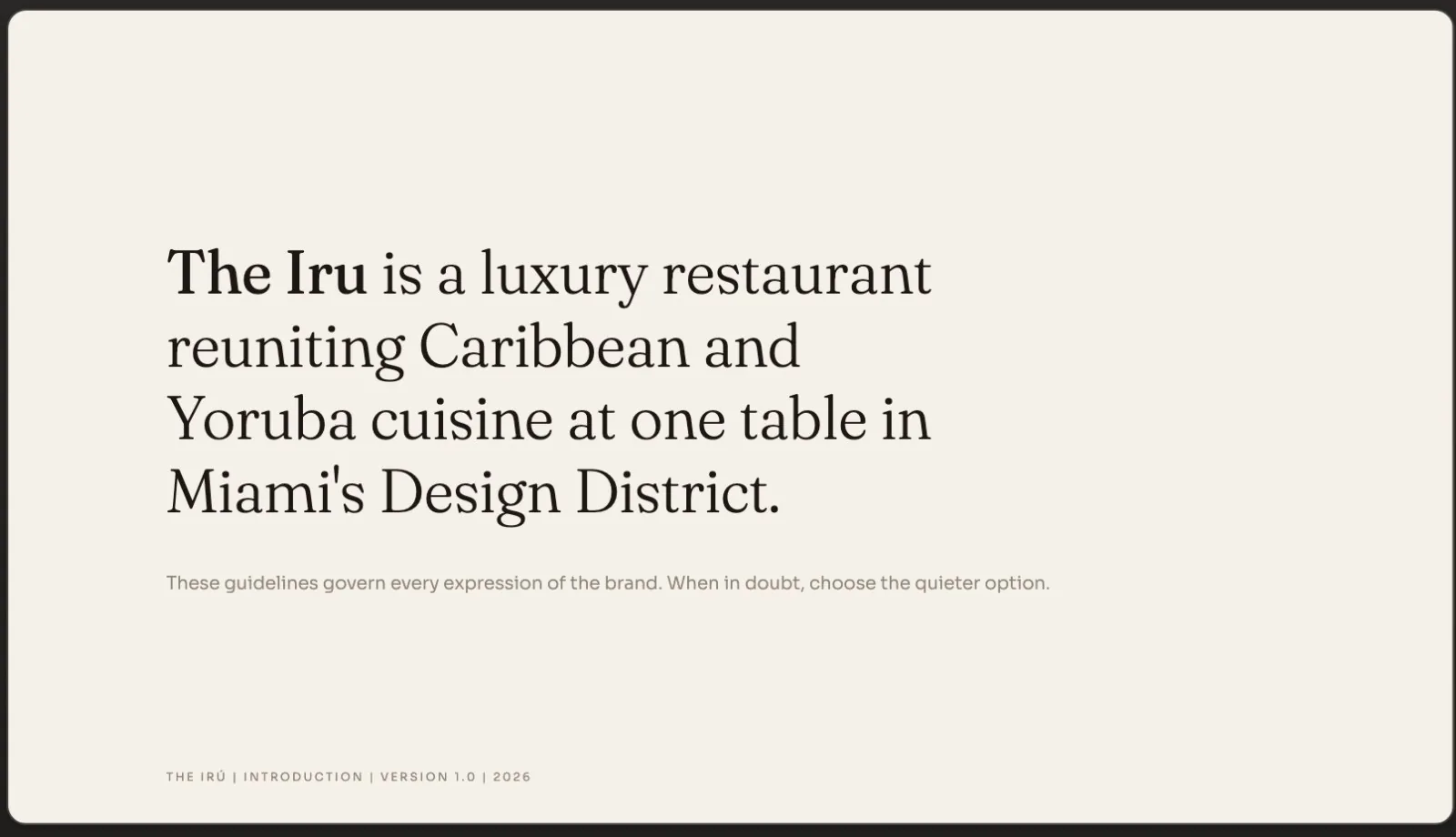
The Iru is a Caribbean and Yoruba fine dining concept in Miami. It's fictional. I've wanted a restaurant like this to exist for years, so I figured, let's build the brand and see what happens.
Everything else about it is real. The strategy, the identity, the design system and the website are all things we actually made, and it's the same process we run for paying clients.
The process breaks into six phases: intake, research, foundation, taste, identity lock and assembly. Let's go through them.
03Brand discovery
Every project we take on starts with a brand discovery session. It's a conversation we have with the client when they come on board, and it covers a lot: what they offer, the vision, the values, the tone, brands they love, competitors, what makes them different, who they're trying to reach, and what's getting in the way.
Do it live if you can. One answer almost always opens up a question you didn't know to ask. The doc we use for this has been refined over ten years, and it's the starting point every single time. We've turned it into a Claude skill too. DM me if you want it.
We run the session on Zoom, record the transcript (I like tl;dv for that), and then the transcript plus the finished discovery doc is what we hand to Claude.
This is the catalyst for everything.
04Research and validation
Before any design happens, we do our homework. First we check the name against the real world with tools like Trademarkia, so we're not building a brand we can't own. Then we look at the category at its best, because a luxury brand has to look the part.
Here's the prompt I ran. The skill it calls checks the name, maps keywords to pages, flags risks, looks for the market gap and writes an FAQ.
Three findings ended up shaping the whole brand. Iru is a real word, the foundational Yoruba seasoning you taste but never see. The category is Michelin approved in London, established in New York, and nobody has claimed it in Miami. And Zobo and Zaya are the same drink with two names, one on each shore. That last one became a menu item.
I'm uploading the completed brand discovery for The Iru. Run the 5Four discovery-to-design skill, run the gap check, then the research and validation appendix. Project code is [CODE].
Michelin approved in London. Valid in New York. Unclaimed in Miami.
05Style board and logo
The first logo concept and palette came back and I liked the direction, but I had opinions. So I opened Figma and put together a quick style board: fonts in the Clarita family for that elevated feel, Yoruba colors with a Caribbean influence, some flat icon and fine line illustration references, and a few websites I liked for contrast.
Then I handed the board over with this prompt.
What came back was noticeably cleaner. You don't need a design background to do this step. Start simple and keep nudging it toward what you like.
Here's the Figma style direction board as a PDF. Read it back as named directional lanes before translating anything. Use half-clean font use, oxblood and gold line work to keep it clean and linear, large image sections and flat illustration.
This keeps your fingerprint on it. You still do the research. You still talk to the client.
06Identity lock
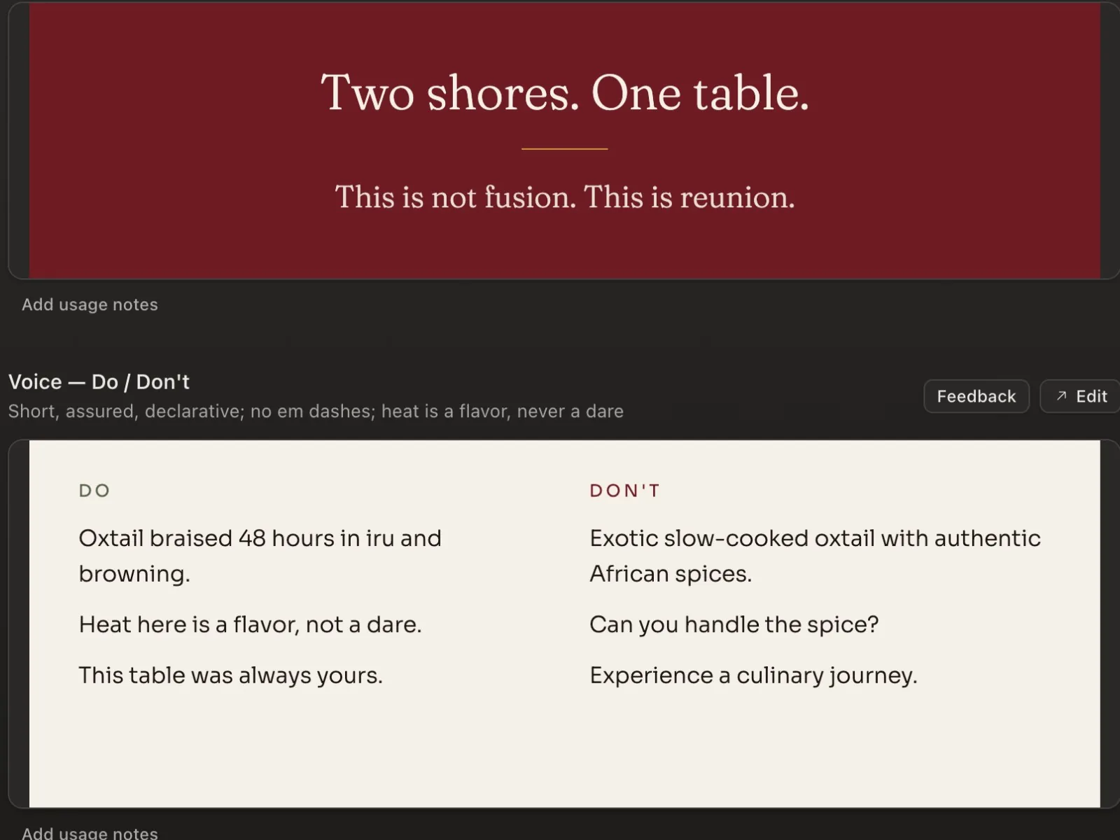
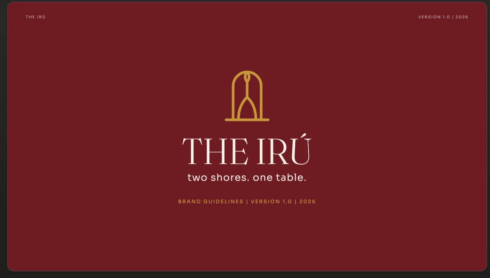
With the direction set, we locked the pieces. The tagline is Two shores, one table. Then the story, the palette, and the fonts. We lean on Google Fonts because they're free for commercial use and there's plenty to choose from.
The mark tells the story on its own. The arch is the passage between two shores, African and Caribbean. The baseline is the table. The two lines are the two traditions, and they converge into one. Then the sea.
From there we built out the lockup and the primary logo and started sketching iconography. Once that main lockup is locked, you're ready for the design system.
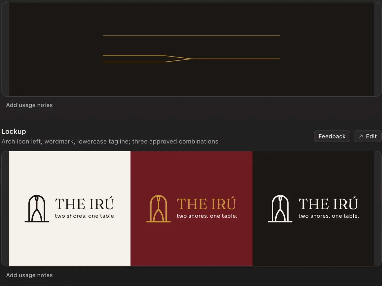
The logo is the brand story in five strokes.
07Building the design system
Here's the order I upload things: the guidelines first, then the logo lockups (horizontal, stacked and the icon on its own), then the fonts I want. You can ask Claude to suggest fonts, but I'd rather choose.
From that, Claude Design builds the content fundamentals, the visual foundations, the icon and illustration rules, the logo section, and an index of every file including the skills. You get dividers, lockup rules, do's and don'ts, wordmark, color and type. Honestly, that gets you about halfway.
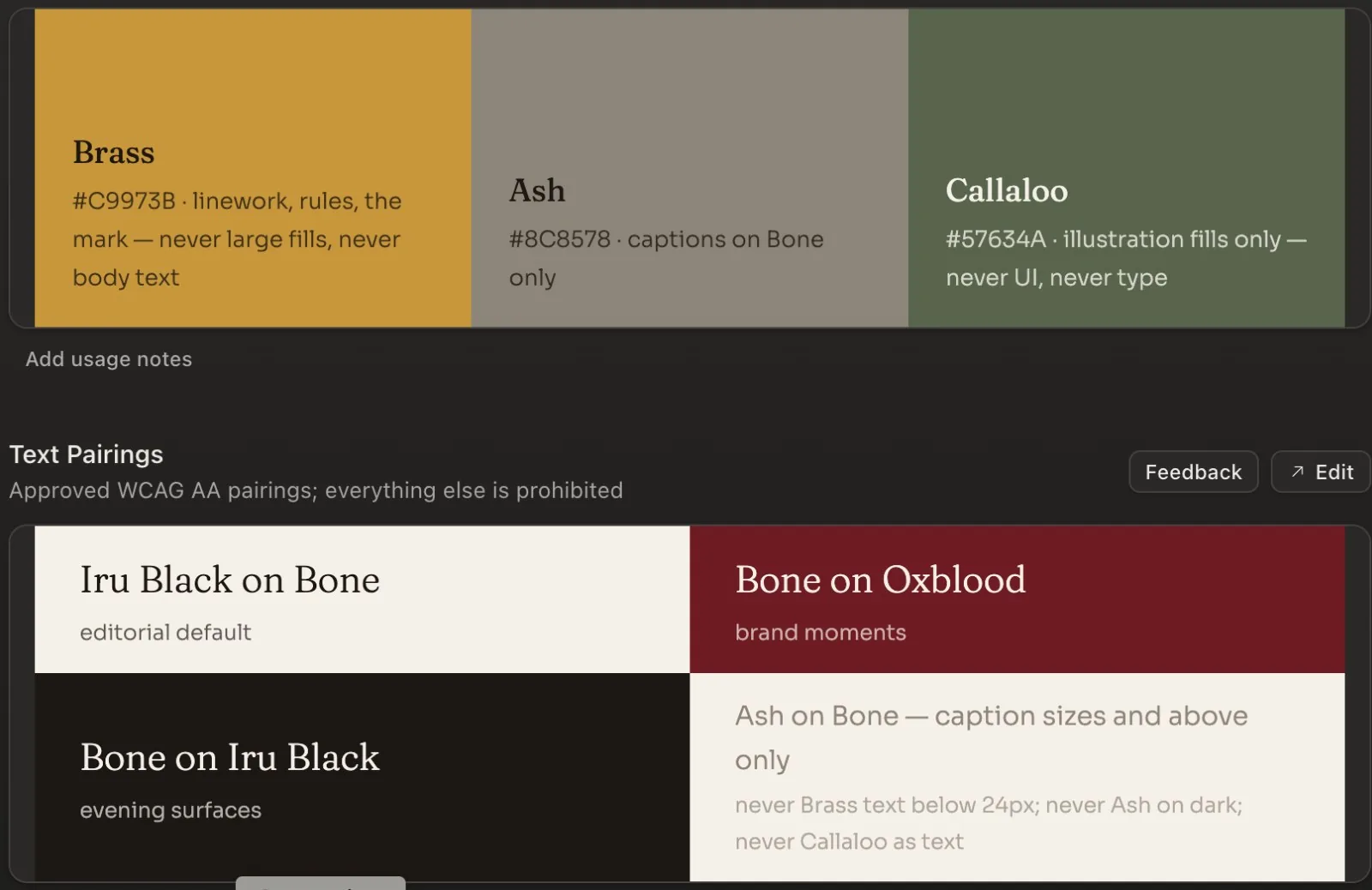
The components I always ask for: wordmark, eyebrow divider, buttons, footer, navbar, menu items and text link. And I set hard limits up front. Warm oxblood and amber gray in the scaffold, a small body palette, and a flat ban on blue, teal, pink and neon.
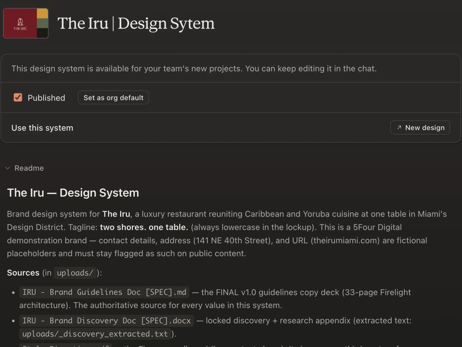
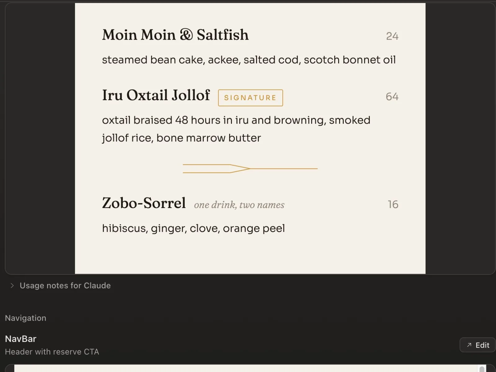
Limitations are what focus the brand.
08Illustration direction
For the illustration style, I started with images I liked and had a real back and forth with Claude about art direction. I also recorded a quick screen video walking through the references. This was the prompt.
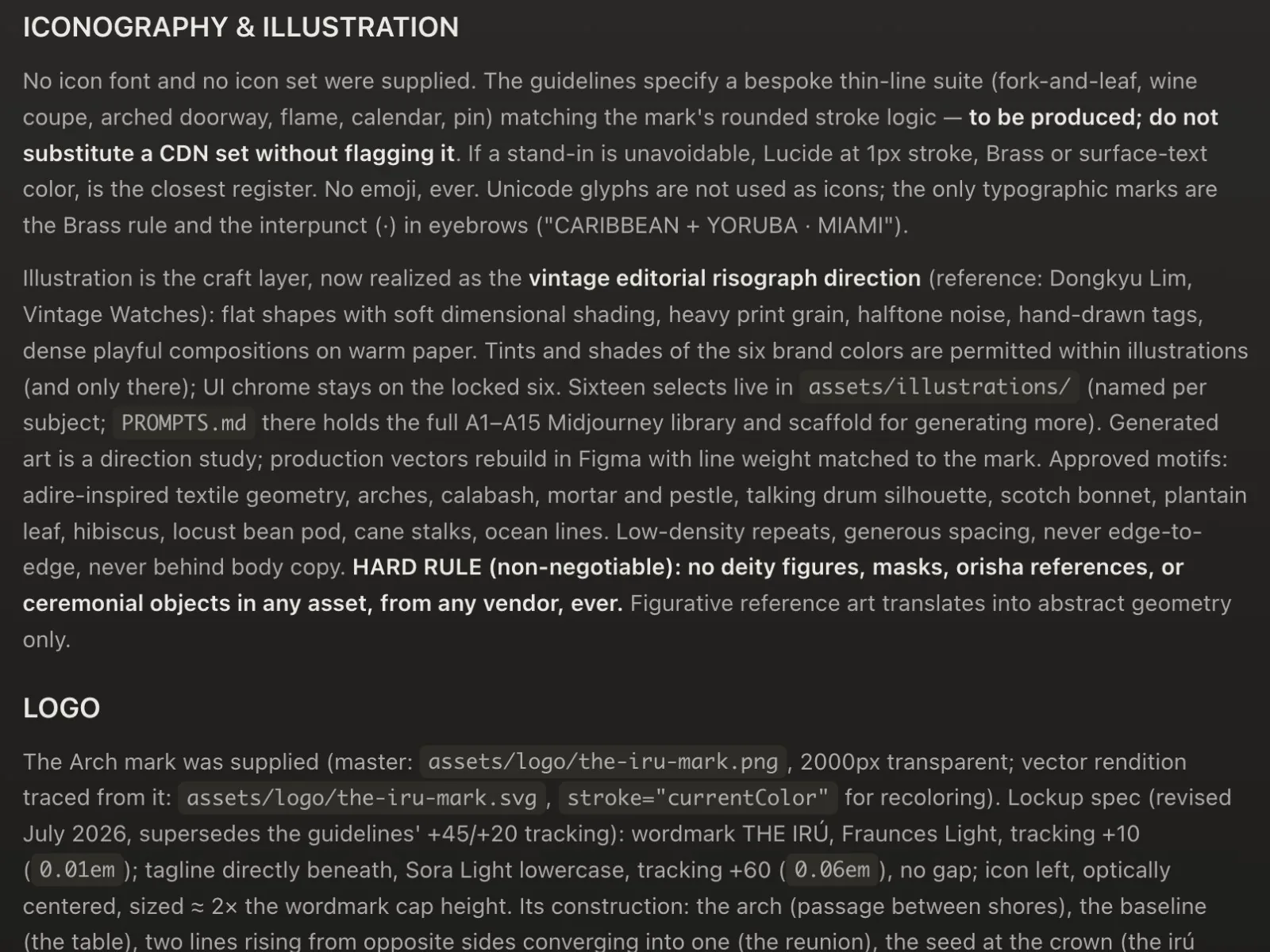
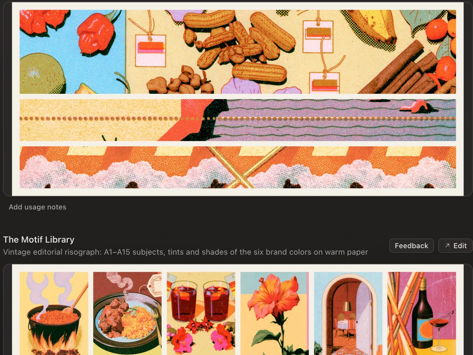
After a few rounds I ended up with two top level scaffolds I can drop into any prompt, so every image comes out looking like it belongs on the same menu. Those went into the design system as banners, images, a motif library and illustrations. The system won't ship with all of that, so keep adding to it.
The rules the AI is never allowed to break live in there too. No deity figures, masks or spiritual imagery. No colors outside the palette. No invented facts, anywhere.
I found an illustration aesthetic I really like. I want to create an illustration direction and an image direction with 15 images for each. Here are some image styles I'm inspired by. Can you create the prompts I can use in Midjourney for things relevant to the brand I'll need? The goal is a beautiful long-form landing page for the website: restaurant interior, plated dishes, ingredients.
09System before site
Here's the whole idea in one line. If you build the site first, every page is a new set of decisions. If you build the system first, every page starts with the decisions already made.
Quick recap of the six phases. Intake is the discovery and the assets. Research is the name, the category and the iconography. Foundation is the story and the tagline. Taste is the Figma board. Identity is the palette, type, mark and icons. And then you assemble the design system.
Next up is the brand guidelines. If you've got questions, drop them in the comments. And if you're a business owner who wants something like this built, reach out. Peace, y'all.
Consistency isn't a style. It's a sequence of events.