01Welcome back
Welcome back for part two. This series is about building a brand and a website natively in Claude Design, with a couple of helpers like Midjourney and Vercel. If you haven't watched part one, start there.
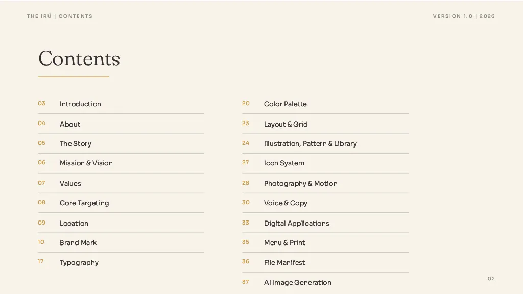
In this one I'm showing you how we built the brand guidelines for The Iru. It's a long form document. It sets the design, the visuals, the illustrations, the palette and the use cases, and every page of it was crafted in Claude Design. I'll walk you through it step by step.
02Rules turn a look into a brand
Part one ended with a complete identity: palette, type, mark, icons, tokens, the whole design system. That's the look. Rules are what turn a look into a brand.
Here's why that matters with AI. Every generation nudges a hue. Every layout invents its own spacing. Twenty small decisions later the brand is a different brand, and nobody chose it. Consistency is never an accident. It's enforcement.
Consistency is never an accident. It's enforcement.
03What the guidelines actually are
The guidelines aren't a style PDF. They're a copy deck that governs the entire brand. Written page by page with the exact copy, so the design gets pure layout and nothing is left to improvise.
The goal is to give the model as much information as possible so it can make informed decisions. The design system comes first because the guidelines pull from it: the swatches, the type, the components.
04The reference deck
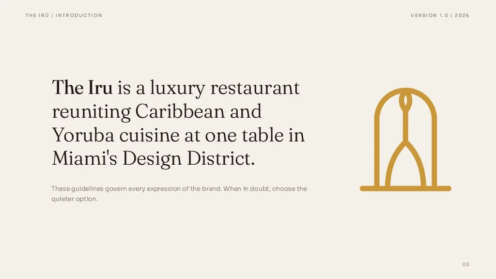
We gave the AI a reference deck to learn the architecture from. It's a brand guideline we built from scratch in Figma for a client called Firelight Media, back in 2020 and updated in 2024. Introduction, about, programs, mission, values, core audience. That structure is the blueprint we carry into most client work.
We uploaded that deck along with the logo files and some notes on how we wanted The Iru's version to feel. Claude took the structure and rebuilt it for the new brand.
The order matters. Whoever reads the document, whether that's a client, a vendor or a new hire, should understand why the brand exists before they learn how big the logo is. Meaning before mechanics.
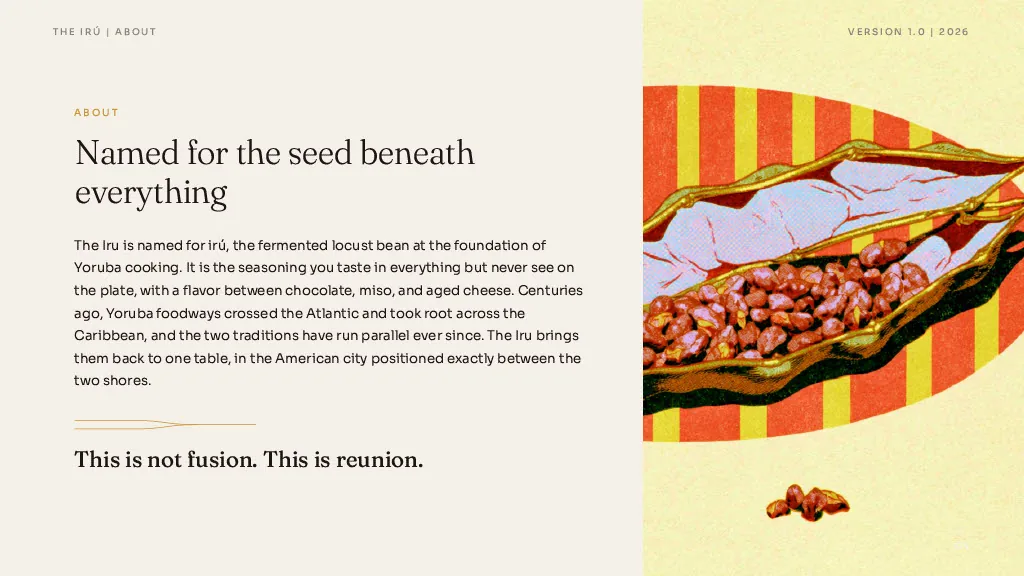
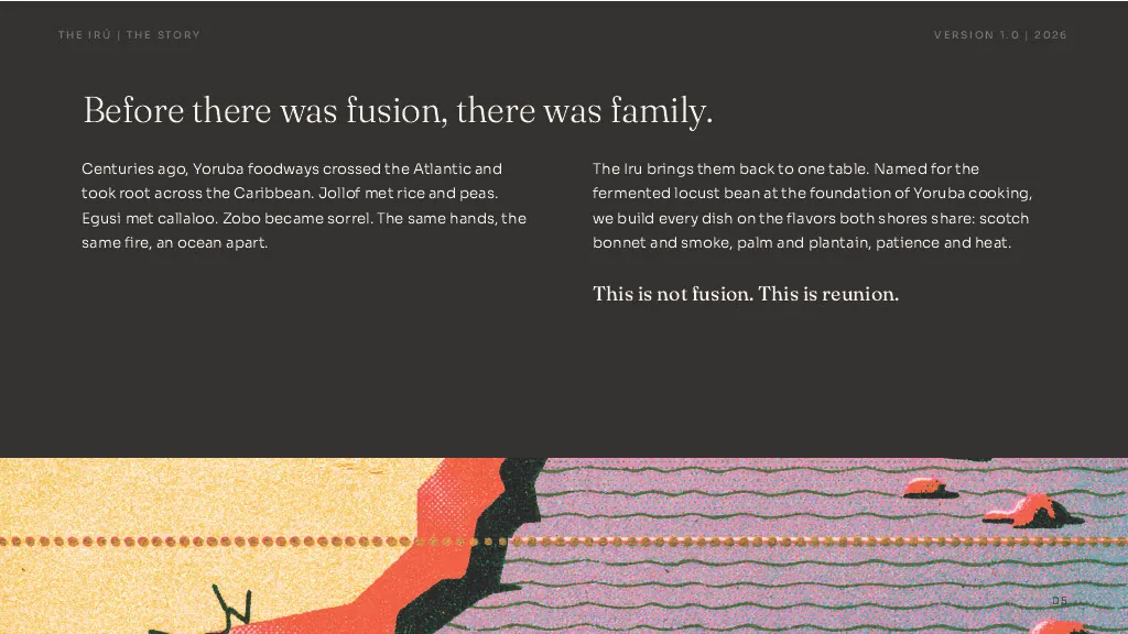
Meaning before mechanics.
05A living document
The identity hangs from one line, and that line lives inside the governing document, not in a strategy deck nobody opens again. The guidelines are a living document. Keep them in Claude Design and reference them every time you build.
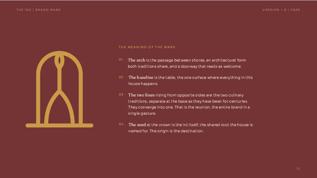
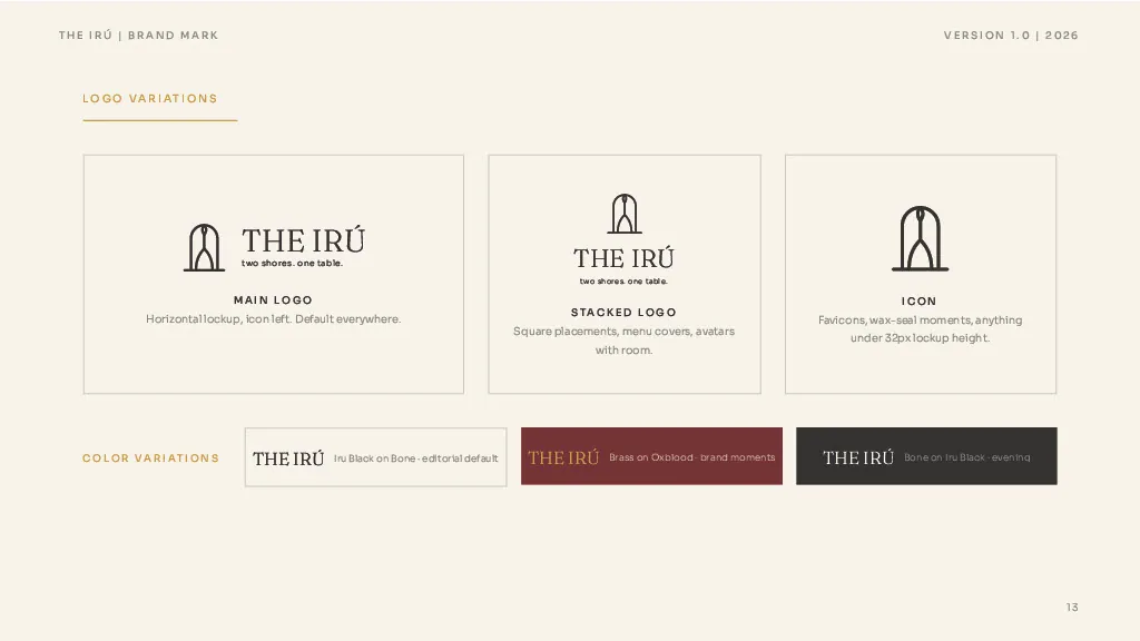
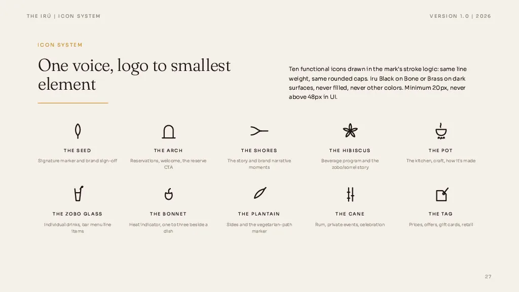
Because we set up a structured format, the logo section writes itself: the meaning of the mark, the primary lockup, the stacked lockup, the icon alone. Those fundamentals are what make the document something people can actually use.
06The misuse list
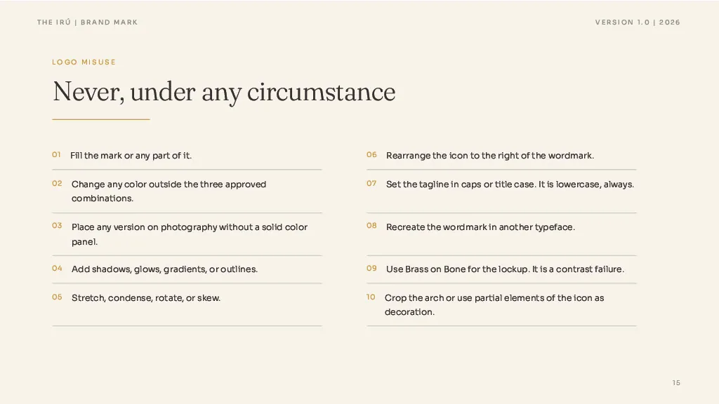
Every guideline needs a misuse list. Never recreate the wordmark in another typeface. Never set the tagline in caps. Normal stuff for anyone who's done branding, but the AI only knows it if you write it down.
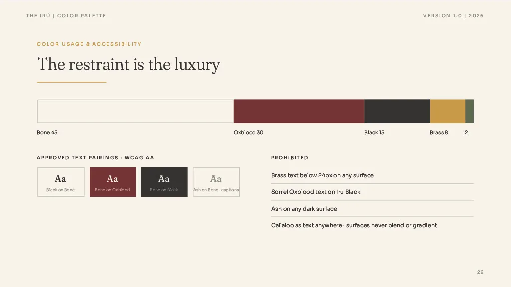
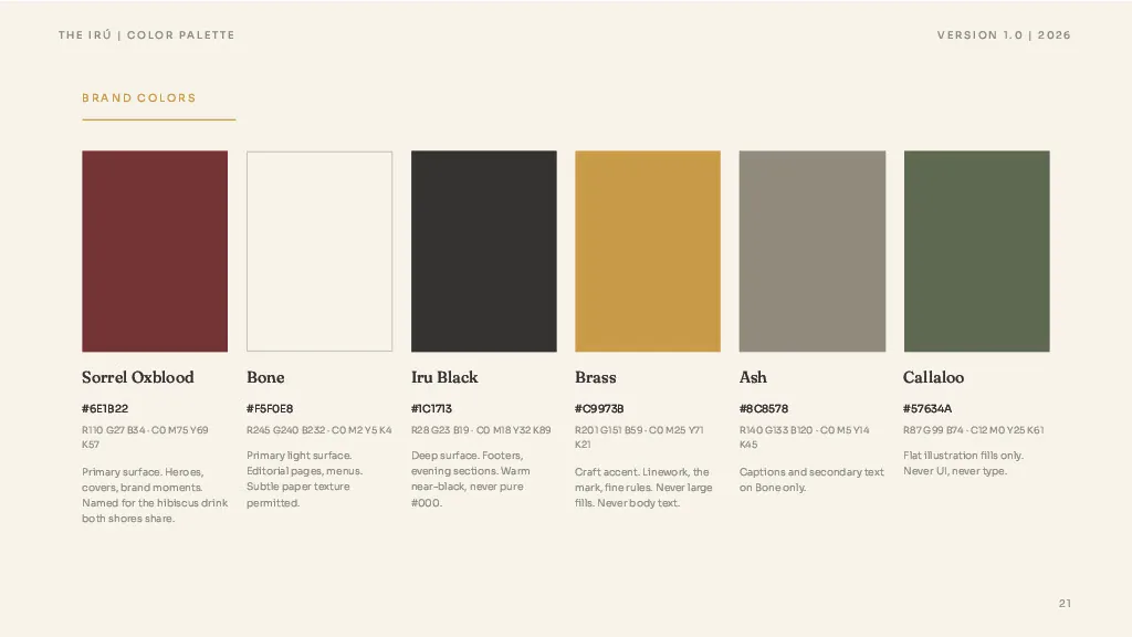
We cap it at ten items per page. Colors get the same treatment, every value specified in detail. And because the design system feeds the guidelines, you can update either one and it reflects in Claude Design in real time.
07Photography and voice
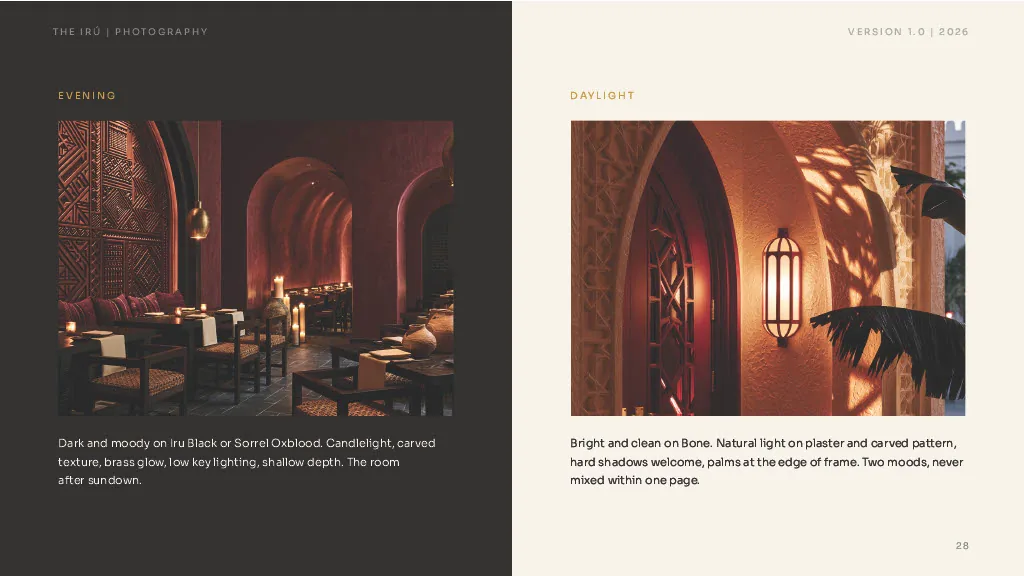
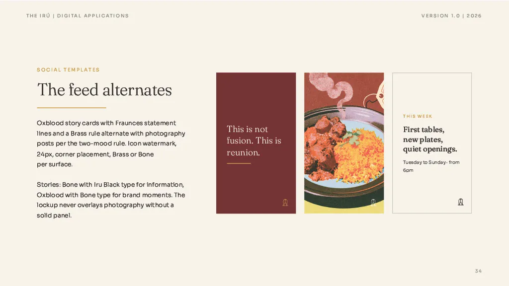
Photography has two moods, evening and daylight. Every image and illustration follows one of them. These were made in Midjourney with our own naming system for the content.
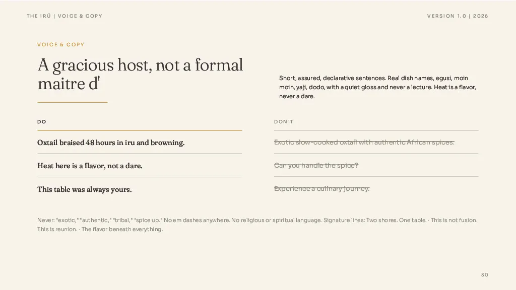
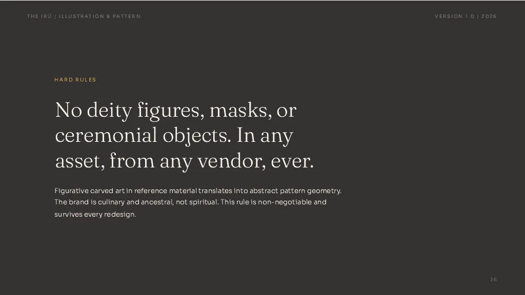
Voice has a banned list: no em dashes, no religious or spiritual language, no exclamation points, no error states. Then the do's and don'ts that show what the voice sounds like when it's right.
08The two paste-ready briefs
The final pages are two briefs you can paste straight into Claude Design. Brief A builds the guideline deck itself. Brief B builds the website, which is the next video. Everything the model needs to execute lives in those two pages.
Once the deck generates, go through it page by page. Don't leave it to the platform. Check that every line matches the copy deck.
Design a brand guideline deck for The Iru using the page-by-page copy provided. Surfaces alternate between Sorrel, Oxblood, Bone and Iru Black per the section moods. Follow every rule in this document, especially the misuse list, the color pairings and the illustration rules.
09The image aesthetic
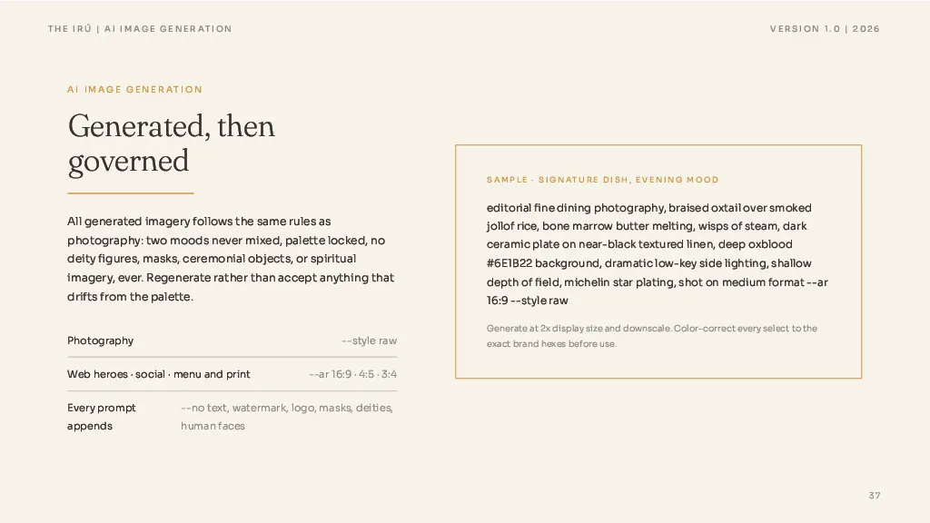
With the deck locked, I asked Claude to write an image prompt based on our aesthetic, and I uploaded a reference image I loved for the look and feel. Let the design system and the guidelines inform the images, then add a reference to sharpen it.
Claude gave back universal rules plus a scaffold. Combine the two and you get a prompt that produces consistent images every time. You can see the result on the live site: the transatlantic line from Africa, the pot of jollof, the subtle grain layer. Same aesthetic across the board.
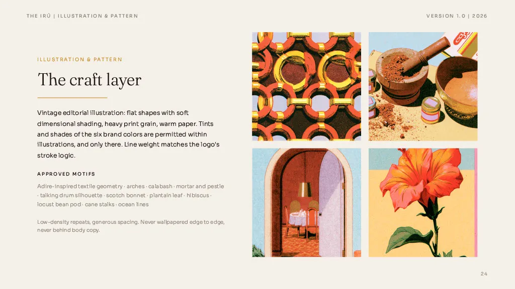
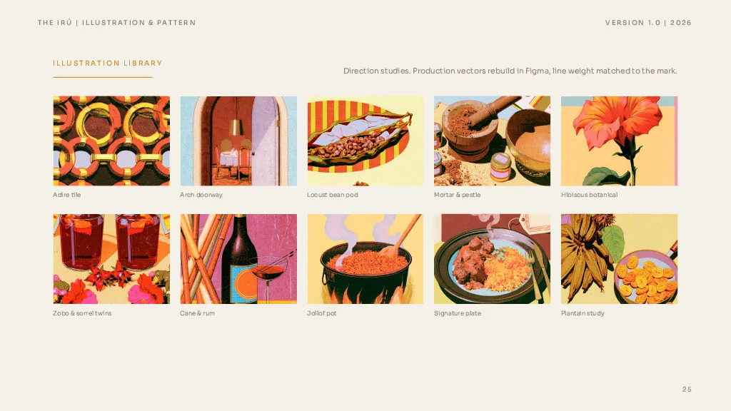
I worked this like a creative director with a full design team. Upload references, check alignment, upload more illustrations, get feedback, refine. Same for the interior: West African and Nigerian roots with a high-end Miami finish.
I want to create an illustration direction and an image direction with 15 images for each. Here are some image styles I'm inspired by. Give me universal rules plus a scaffold I can reuse in Midjourney for everything the brand needs.
Editorial fine dining photography, [SUBJECT], warm directional light, shallow depth of field, palette limited to oxblood, bone, brass and iru black, subtle print grain. No blue, no teal, no pink, no neon. No deity figures, masks or spiritual imagery.
Let the system inform the image. Then add a reference to sharpen it.
10Ready for the website
Upload checklist for the next phase: the guidelines doc, the logo SVGs, the icon sheet or inspiration, and the fonts. I like Google Fonts because they're free for commercial and personal use.
Then verify. Go through everything in detail before you move on. With the design system and the guidelines in hand, you have everything you need to make an informed decision about the website. That's part three. Questions in the comments.