01Where we are
We're back with part three on building a restaurant brand entirely with AI using Claude Design. If you haven't, check out the last two videos in the description.
Part one, we built the identity: the design system, the visual cohesion, the logo, the mark, all the visuals. Part two, we took that system and wrote a 38-page brand guideline that governs the entire brand.
Now that both briefs exist, we can output an entire website design. Those two documents keep everything aligned, clean and consistent.
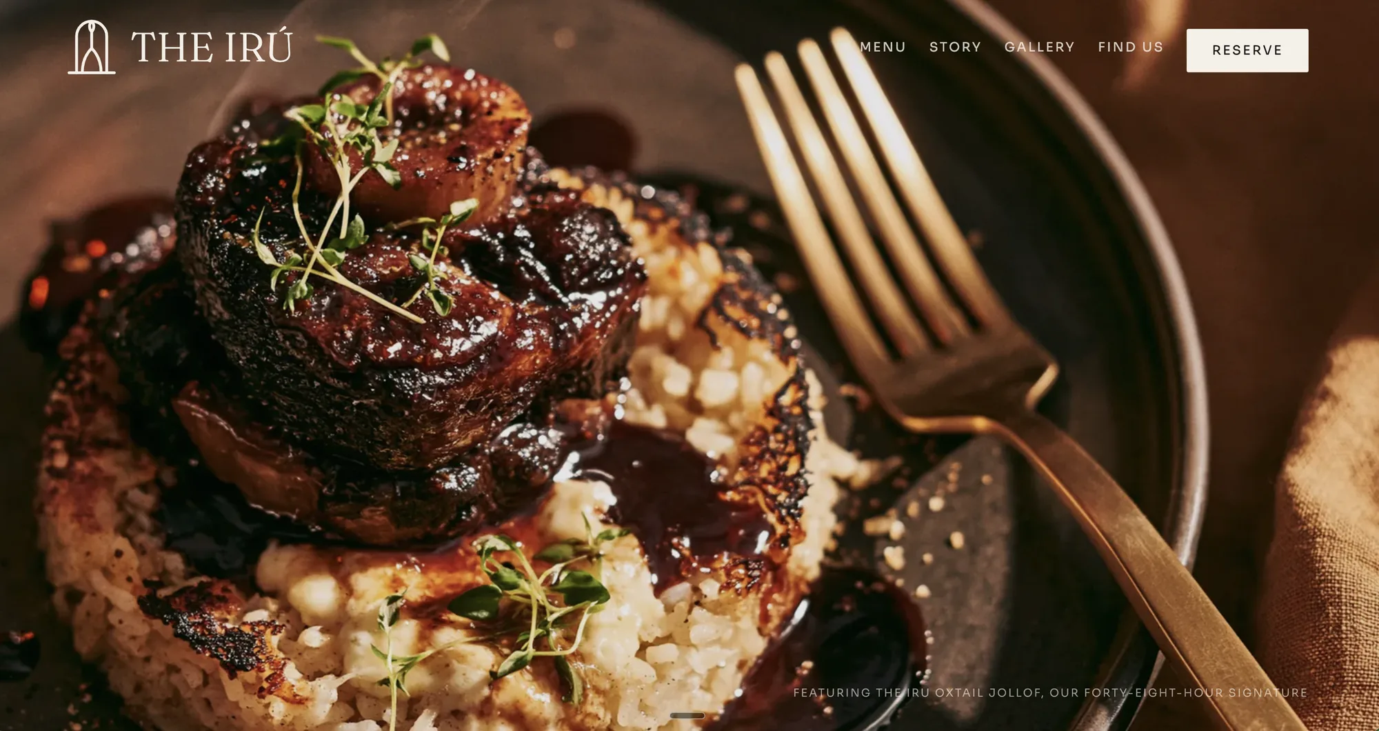
The system exists. The law exists. Now, the website.
02Rule one: build on the components
The first thing we tell Claude Design: build on the existing design system components, do not restyle from scratch. We don't want it deviating from what we've already created.
The website is built from the system's own parts, the buttons, the divider, the wordmark. It isn't designing from zero. Preface your prompt with this before anything else.
03The four uploads
Four files go in. The brand guidelines, which is the law the build answers to (if the file is too big, export pages as PNG or JPEG). The logo masters, every lockup and color variation you want in the site. The icon sheet, the ten icons that share the mark's stroke logic. And the fonts: the licensed files, all weights, not look-alikes.
Then this prompt. Say it verbatim.
Build on the existing design system components. Do not restyle from scratch. Design a single-page landing site for The Iru. Palette, type, logo, illustration, photography, motion and UI rules exactly as specified in the guidelines. The guidelines govern every decision.
The authority lives in the file, not in the prompt.
04What the guidelines never covered
The guidelines don't cover section order, navigation labels, conversion path, mobile behavior, component layout or motion choreography. You can hand over a loose layout doc, but I let it run free at first, then get more nuanced.
Six specs the brand doc was never going to have: the section order, top to bottom (nav, menu, story, gallery, find us, reserve); reserve flows to email, no booking widget; the mobile version; a second-by-second preloader spec; and the menu block layout and its rules. We work through each one step by step.
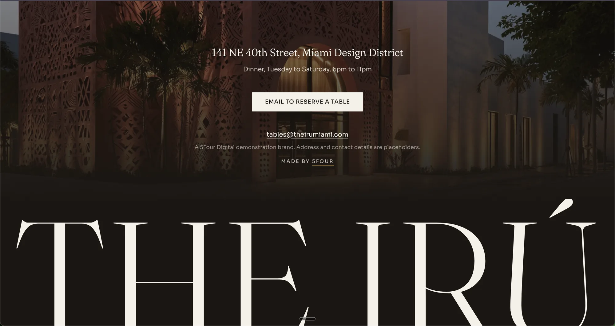
The result is the live site: story, gallery, all the assets. You wouldn't guess it was AI-generated. It looks clean, luxury, high-end.
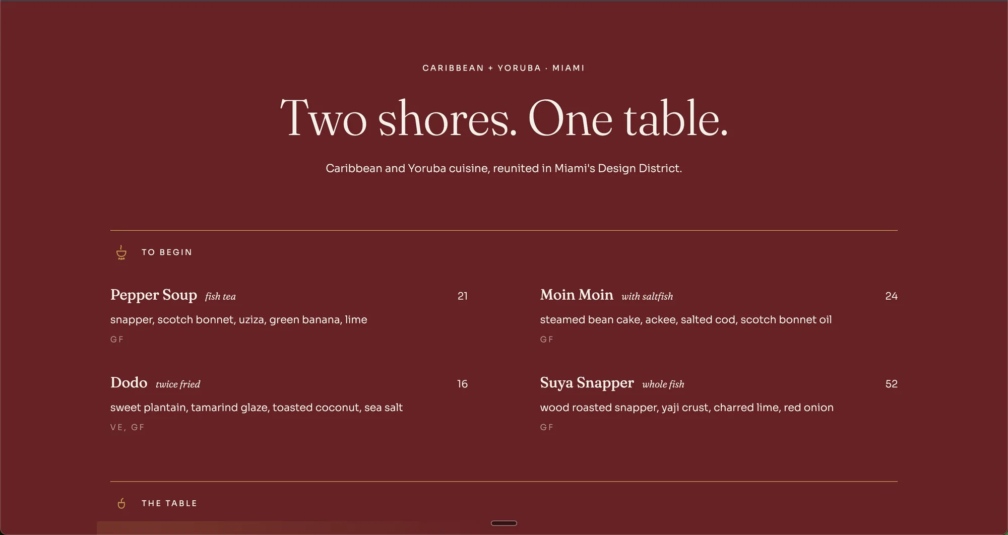
05Consistent photography with an art direction doc
Keep your chats separate. Copy, architecture and strategy conversations live in conversational Claude. Anything design lives in Claude Design.
I uploaded an illustration aesthetic I liked and asked Claude for an art direction doc. That doc is where the brand's illustration style came from. Then we anchored the image style to a reference image and locked the palette. Name each color in words and hex, state limited palette only, ban drift colors by name, and lower the reference weight.
For the dishes, one prompt does all of them. Swap the bracket, keep every other word, and use each output as the next reference image. We used Midjourney; Higgsfield or others work too. The stack was Claude, Claude Design and Midjourney.
Editorial fine dining photography, [DISH NAME], plated on bone ceramic, oxblood linen, brass cutlery, warm directional light, shallow depth of field, limited palette only: oxblood, bone, brass, iru black. No blue, no teal, no pink, no neon. --ar 4:5
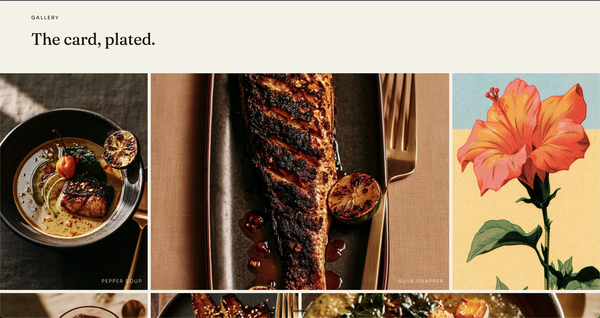
Swap the bracket. Keep every other word.
06Directing the homepage
The opening prompt was simple. No reference image; I like a fresh canvas. If you're not a designer, pull references from Land-book, Awwwards, Dribbble or Pinterest.
Then corrections, one at a time: double the logo, use this illustration for the hero, remove the box over the image, here are the exact nav items. Desktop first, section by section, no animation yet. Tablet and mobile after.
There were about twenty corrections: bigger fonts, transparent navigation, logo at 2x, cut the newsletter section, align the menu prices. Half were taste. The other half became permanent process and now live in the brief addendum, so the next project starts ahead.
We're creating an epic homepage for The Iru. I've attached the design system and brand guidelines. Full image or video header, very forward-thinking luxury one-page design. Let's work.
Let's make a few changes. First, double the size of the logo. Use this image for the hero. Remove the box over the image and put it in the section below. Here are the specific navigation items: Menu, Story, Gallery, Find Us, Reserve.
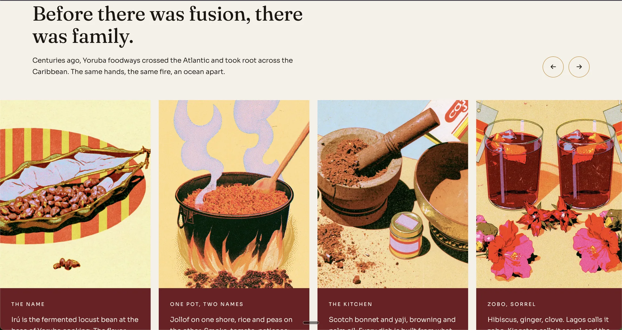
The AI executes. The human directs.
07Interactions and animation
Once the layout was locked across breakpoints, we added interactions. This is what separates the site from the competition. The whole pass took about 45 minutes.
For a section with breakout image cards I uploaded a screenshot reference with hard edges to match the brand. Then: "Let's add a preloader. Logo animates in, then the screen wipes up into the site." A few iterations and it landed.
From there, subtle section reveals, a signature menu overlay, hover states, and a small effect at the bottom of the page. Enough motion for a luxury feel, not so much that you sacrifice accessibility or page load.
Last round of changes. Start adding interactions. Add a preloader: logo animates in, then the screen wipes up into the site. Then subtle section reveals on scroll, a hover state on menu items, and a signature overlay on the menu section. Keep motion restrained; accessibility and page load matter more than flourish.
Enough animation to feel premium. Not enough to overwhelm.
08Disclose, audit, canonize
As the build wraps I ask for a full disclosure list. Inverted course names, a new opacity system, five breakpoints. That list gets folded back into the design system.
Then we audit the page line by line against the document. One catch: the AI wrote "our award-winning signature." This is a spec project; nothing has won anything. We changed it to "our 48-hour signature," which is what the oxtail would actually take.
Everything learned is written back into the guidelines as an addendum. Brief and addendum, upload, build on components, direct with corrections, disclose, audit, fold back.
List every design decision you made during this build that was not specified in the brief or the brand guidelines. Do not omit small ones.
09Next: from design to live URL
The site is done and fully responsive. Part four covers the coolest piece: taking this from a design tool to a live URL through GitHub and Vercel. A simple one-pager, no CMS, live in an afternoon (you could do it in twenty minutes), and every future edit is a one-line change.
If you got value from this, comment and subscribe. Excited for the next one, y'all.